1- Supplies
You should always use a pencil while drawing. Pen is fine for a doodle, but when you're doing serious work, you NEED a pencil.
There are a few different types of pencils that you should know about. The first and most important is HB. This is the one you used in elementary school, but it is extremely useful for sketches. Next are the H's. These are fine and hard. They are better for lighter markings and work far better when properly sharpened. The exact opposite are the B's. These make thick, black markings and are very soft and easy to use, but as fun these are to use, they should only be used for shading.
Also, NEVER draw on lined paper. Always use plain white or any paper you have in a sketchbook.
To wrap up, your standard supply list should include:
-The following pencils- two or more HB's, 2H, 4H, 2B, 4B, and 6B
-2 or more erasers (No pink, hard, or funky ones, white or kneaded are best)
-A mechanical sharpener that is very sharp
-A sketchbook that is at least 7" by 4" if you're planning on doing serious work. Anything smaller is fine for doodles.
-If you want to add color to your drawings, then have craypas, colored pencils, or paints. Don't use crayons!!! Also, if you're using paints, make sure to have the brushes that I like to call: thin, superthin, square-shaped, and thick.
-Something to put it all in!
2- Color
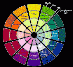
The color wheel is made up of six major colors: Red, orange, yellow, green blue, and violet. Each color on the wheel has an opposite, or complement. These are red and green, blue and orange, and yellow and violet.
Warm colors are colors that can be related with the sun. These include red, orange, and yellow.
Cool colors are colors that can be related to water. (This is why they call this the basics.) These include green, blue, and violet.
Terms to know
Hue is a pure color, like red, blue, or yellow.
Intensity is the brightness of a color. To lower the intensity of a color, add a touch of the color's complement.
Value is the lightness or darkness of a color. To make it lighter, add white. To make it darker, add black.
Primary colors are colors that cannot be made by mixing two colors together, but can be mixed together to make another color. For example, take two primary colors, blue and red. Mix them to make purple, a secondary color. (psst! Keep reading!)
Secondary colors are the colors that are the result of the mixture of two primary colors. I think you get it, so I'll move on.
Tertiary colors are the result of a mixture between a primary color and a secondary color. (NOTE: the primary color has to be included in the secondary color. For example, you can't mix yellow and purple to make a tertiary color, because they're complements. That would make brown!)
Note:
When creating a character, consider the colors you're using. Warmer colors usually make for good characters, while cooler colors make for evil ones. For example, pale skin could resemble purity, and black hair can make a character look brooding (think Sasuke!).
3- Basic Shapes
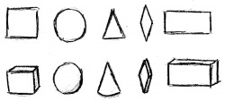
The objects you see here are really the only five shapes that you will ever need when drawing manga. These five shapes are a square, a circle, a triangle, a diamond, and a rectangle. Below these are the same shapes, but this time with depth. Easy, right? Notice how they all have foreground and seem to be going back. You should never make a 3-D object look like a 2-D object by making it seem head-on. Even if that's how it really looks, well, hey, we're drawing manga, right? It's not supposed to look real! Also, notice how the 3-D version of the triangle is not a pyramid or a triangular prism, but a cone. When drawing, it's usually good to give things rounded edges instead of straight edges. It makes the drawing more appealing and appealing to the eye. You may be wondering, "Well, this is all fine and dandy(lol), but how could I use this in my drawings, unless I'm taking manga geometry?" These shapes can be used in almost anything, even figure drawing. If you don't believe me, look at this:
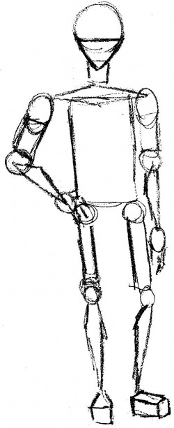
Basic Shapes- con't
See? It looks like a figure, right? And if you can find a shape that wasn't included in the five above, then you have cataracts. Also, see how I only used the 2-D shapes. Although you don't necessarily have to make your shapes 3-D, you should always picture them as being 3-D. Once it comes time to add details, you'll be glad you did this. What the artist sees is what the viewer should see. This technique will make your art look more real.
